Blog
Wayfinding – Design Techniques that Keep Visitors from Getting Lost

Endless corridors that seem to lead nowhere…. Poorly marked entrances…. Multiple elevator banks and incomprehensible signs….
Hospitals are realizing they have a design problem as patients and visitors struggle to navigate the maze of the modern medical complex. Confusing layouts and signage add to patients’ anxiety at a time when many are feeling ill and are coming to the hospital to undergo tests and procedures.
Traditionally Wayfinding encompasses all of the ways in which people orient themselves in physical space and navigate from place to place.
Recently, hospitals have been incorporating new “Wayfinding” techniques to help patients and families navigate expansive hospitals.
Below are some examples of new wayfinding techniques that are being incorporated into hospital design.
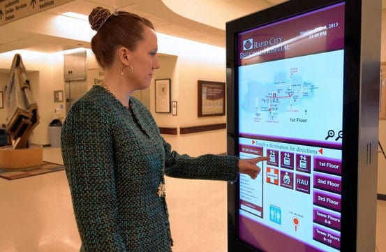
1) Maps and Kiosks….

Sarah Hermsen, an employee at Rapid City Regional Hospital, demonstrates a direction-guiding digital kiosk. Regional Health
2) Land Marks

Landmarks, such as this tree sculpture at Houston’s MD Anderson Cancer Center, aim to reassure people they’re on the right path. MD Anderson Cancer Center
3) Guides

At UCLA Medical Center, Santa Monica, college-student interns escort patients to their destination. Laura Landro/The Wall Street Journal
Old techniques are revamped and used as a cure for difficult to navigate hospital designs and help patients and visitors from getting lost.
*Article Sources: Wall Street Journal – See the full article here and Wikipedia – Wayfinding.


1 Comment
Hospital Administrators Look to Designers to Help Improve Patient Flow | WIKOFF DESIGN STUDIO, LLC
June 22, 2014[…] Wayfinding – Design Techniques that Keep Visitors from Getting Lost […]