Blog
Expert Advice on How to Place Colors in a Healthcare Environment
 In the past, we have discussed the different meanings and importance of colors in healthcare design. Below is an excerpt from Healthcare Design Magazine‘s interview with Jackie Jordan, Director of Color Marketing for Sherwin-Williams. In the interview, she explains that it isn’t necessarily the color, it’s how you use it. To read the entire interview on the Healthcare Design Magazine website, click here.
“It’s not necessarily the color, it’s the placement of the color….” – Jackie Jordan, Director of Color Marketing for Sherwin-Williams.
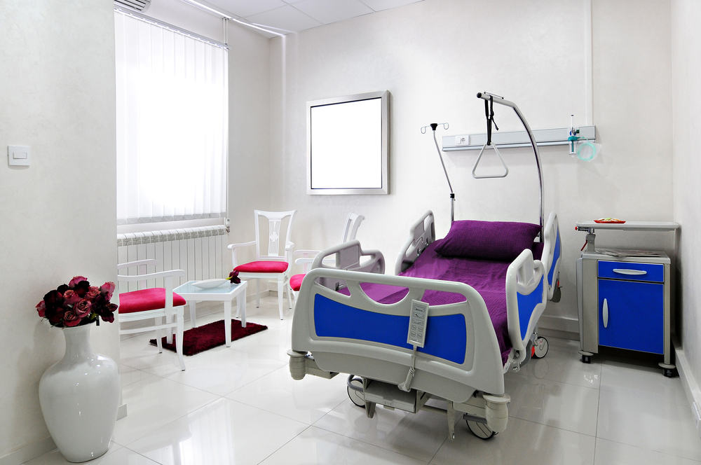
The color expert recommends doing a bright, cheery color behind a patient bed as opposed to in front of the bed. She feels it will work more appropriately. As an example, if you’re in a facility and you first walk into a patient room, you may be pleasantly surprised and effected by a bolder, brighter color. However, if you are the patient, staring at a bolder color all day long could feel overwhelming. Therefore, placing the color behind the patient is a perfect solution.
 If paint isn’t an option, use the cubicle curtain that divides the spaces and the drapery treatment as a place to add some pattern and texture to bring a little bit of color and warmth into a space.
Source: http://www.healthcaredesignmagazine.com/article/healing-hues-choosing-paint-colors-healthcare


