Blog
A Wayfinding Technique that is Unexpected, Creative, Effective and Aesthetically Pleasing
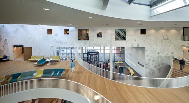
Ever been lost in a hospital? You’re not alone. It’s really a thing. Healthcare Designers solve the problem with Wayfinding Techniques and Programs. A well-planned and implemented Wayfinding Program minimizes the stress associated with finding your way in a hospital. The example here goes beyond that with a creative, unexpected and aesthetically pleasing technique that is ever-so-effective.
Project Overview – Creative Choices

Photo Caption: Wayfinding technique that resonates with locals by incorporating the regions well-known industries and wildlife.
At Zaans Medical Center, in Zaandam, The Netherlands, the wayfinding approach for the 415,000-square-foot medical center also provided a chance to create a strong sense of place by introducing something a little different: black and white line art. The art did a great job at incorporating the local region which makes patients feel welcome.
A unique larger-than-life illustration was created to span the entire length of the entrance area. From afar, you can see a human figure, from up close, you can observe details that relate to the industrial heritage of the region. For instance, the graphic of the human body on the wall of the central hall comprises familiar components of the industrial heritage of the city of Zaandam, The Netherlands, and regional wildlife.
Elements such as the shipbuilding tradition of the region are integrated into the visual, creating an image, which resonates with the local population and instills a sense of pride.
“We wanted to use a specific style that was not common in hospitals, something unexpected, yet aesthetically pleasing. Using the line art, we approached recognizability more subtly, encouraging a more personal interpretation.” – Rene Toneman, creative director and partner at Silo Amsterdam, The Netherlands
Incorporating Wayfinding Techniques and Signs
The wayfinding program comprises a range of signs, overviews, and graphic elements, with illustrations and visuals hand-drawn by in-house designers at Silo and incorporating elements that reflect the area’s rich industrial heritage.
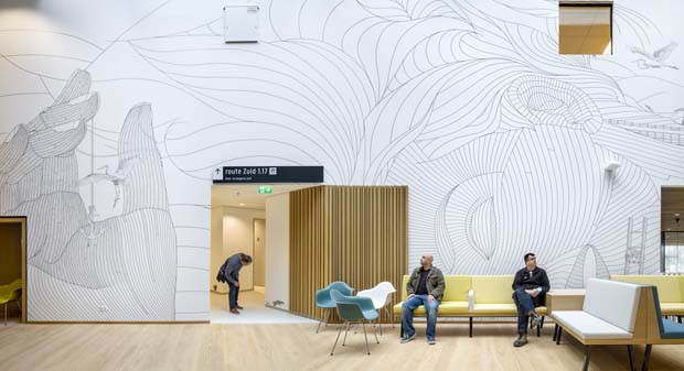
Photo Caption: The mural in the central hall depicts a reclining human figure. Photo credit: Roger Thomes, Amsterdam.
The biggest statement comes in the form of a 328-foot-by-15-foot mural in the central hall, depicting a reclining human figure. While the different elements of the body refer to health and medicine, upon closer look, onlookers will notice parts of the body tell a visual story of the region.
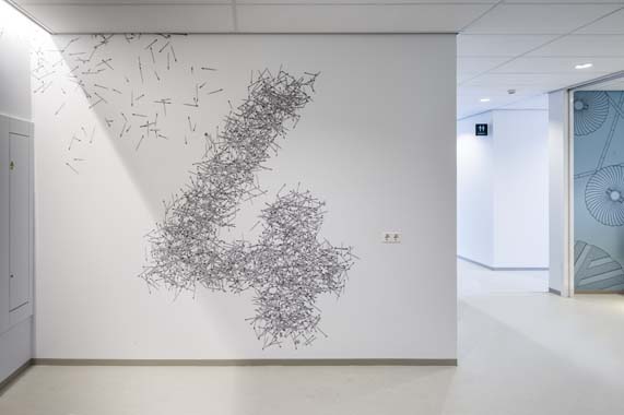
Photo Caption: Here, images of pencils, which naturally refer to office work but also to a local manufacturer of pencils, denote the fourth floor where the staff offices are housed.
Another aspect of the program is signage to demark specific outpatient clinics. Rather than use the often technical outpatient clinic names, designers opted for a numeral system, which is shorter and easier to remember. Additionally, for children and visitors with low literacy, a set of animal icons, including a rabbit, woodpecker, and squirrel, was placed on walls and columns near floor level. The playful animal illustrations not only empower young patients to lead the way to their appointment but also distract them from their upcoming doctor’s appointment.
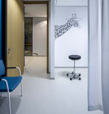
Photo Caption: Zaans Medical Center uses animals to create memorable spaces for kids.
A combination of objects like pencils, biscuits and leaves and animals such as squirrels, fish, butterflies, and a giraffe creates memorable spaces designed to make patients and visitors forget they’re in a hospital.
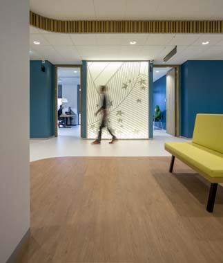
Photo Caption: Zaans Medical Center has lightboxes with graphic designs to show the way.
Lightboxes with graphic designs not only add to the atmosphere but double as directional cues at three-way junctions where there is no direct daylight.
Implementation
While the intention was for the large graphic to look hand-drawn, the size of the graphic along with the facility’s maintenance and infection control requirements made it impossible to be delivered that way, he adds. Instead, a digital design of the image was printed on vinyl-coated polyester wallpaper in four-meter wide strips and then installed over a two-week period.
Completed in January 2017, the building was designed by Mecanoo (Delft, The Netherlands). And Toneman says the ability to address the entire scope, from spatial identity to wayfinding and signage, delivers a cohesive look and feel that’s optimally integrated with the architecture.
“We’ve been able to enhance the entire spatial environment and user experience. The key to the project’s success was to tell a story to which all users of the building—patients, staff, and visitors—could feel connected.” – Rene Toneman, creative director and partner at Silo Amsterdam, The Netherlands
Project details:
- Facility Name: Zaans Medical Center
- Location: Zaandam, The Netherlands
- Project Completion Date: January 2017
- Owner: Zaans Medical Center/Vitaal ZorgVast
- Total Building Area: 415,000 sq. ft.
- Architecture Firm: Mecanoo
- Interior Design: Mecanoo
- General Contractor: BAM
- Engineering: BAM Advies & Engineering (structural engineer), Ingenieursbureau Linssen (mechanical engineer)
- Builder: BAM
- Signage/Graphics: Silo Agency
Wayfinding programs aim to minimize the stress associated with reaching a destination within a healthcare facility by providing signage, graphics, and intuitive design to help direct patients, visitors, and staff. Creativity can go a long way when implementing a technique that is effective at not only showing the way but also at making patients and staff feel at home.
Marie Wikoff is the creator of Wikoff Design Studio based out of Reno, Nevada. Her expertise in healthcare design has helped modernize healthcare organizations locally, regionally, and internationally, improving patient experience and outcomes. Her credentials include Evidence-Based Design Accreditation and Certification (EDAC), American Academy of Healthcare Interior Designer (CHID), the National Council of Interior Design Qualification (NCIDQ) and LEED AP. Contact Marie Wikoff
Source:
DiNardo, Anne. “Drawing A Connection At Zaans Medical Center.” HCD Magazine, 16 Sept. 2019, www.healthcaredesignmagazine.com/projects/acute-care/drawing-a-connection-at-zaans-medical-center/#slide-7.


