Blog
The Brilliant Story of Inova Schar Cancer Institute Teaches Us That Sometimes Hitting the “Reset” Button Is the Best Long Term Solution

As we near the end of what can be called the most tumultuous year ever, I think it’s safe to say that we all welcome a reset. Up until this year, I believe that feeling was foreign to most of us. After all, we work hard, day after day, hustling to accomplish our goals and build upon our efforts. Up until now, the last thing we would have wanted was a reset. That was then… so 2019!
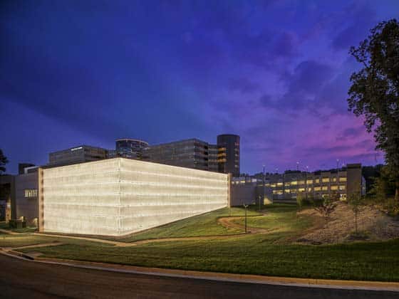
When the Pandemic hit, along with political unrest, racism, and economic uncertainty, we were left grasping onto any sense of normalcy and looking to salvage our prior projects and investments. In life, hitting the reset button means that you and/or your company is going to go through an all-consuming change. A culture shift to new thinking and behaviors. That is where we are today. We are in the midst of making a huge shift and great strides, especially in healthcare design, and though the unknown can be scary, stories such as the one here show us how the reset is an opportunity to build something better. I especially love the pavilion (shown below) that was constructed to accommodate radiation oncology, diagnostic imaging, and proton therapy, as its illuminated glass walls glow through the trees at night.
Healthcare Design Magazine featured an inspiring look at the new Inova Schar Cancer Institute. And even though the story has nothing to do with COVID-19 or Political unrest it has everything to do with welcoming a reset and rethinking everything in order to build something bigger and better, 400 people a day better! Read on or see the original here.
Marie Wikoff is the creator of Wikoff Design Studio based out of Reno, Nevada. Her expertise in healthcare design has helped modernize healthcare organizations locally, regionally, and internationally, improving patient experience and outcomes. Her credentials include Evidence-Based Design Accreditation and Certification (EDAC), American Academy of Healthcare Interior Designer (CHID), the National Council of Interior Design Qualification (NCIDQ) and LEED AP. Contact Marie Wikoff

Photo Credit: © Halkin Mason Photography
Fuel For Change At Inova Schar Cancer Institute
By Jennifer J. Salopek | February 18, 2020
Inova Fairfax Hospital began laying the groundwork for a new cancer facility for its campus in 2012, envisioning a simple medical office building for outpatient cancer services on a greenfield site north of the hospital. But a year into planning, a wooded, 117-acre campus across the street from the flagship—the former headquarters of ExxonMobil corporation—went on the market, presenting a tremendous opportunity to the hospital’s owner, Inova Health System, to rethink everything.
“We hit the reset button,” says Thomas Graves, former vice president of Inova Schar Cancer Institute in Fairfax, Va. “We began the real planning once we understood the facility we were dealing with.”
The new vision called for creating a new health sciences innovation hub with a new cancer institute at the centerpiece that would utilize a holistic model of multidisciplinary care and bring together oncology, surgery, radiation, chemotherapy, physical therapy, counseling, and support services.
“By collocating all these services in a single location, and given its proximity to the Beltway, we thought this would be a tremendous opportunity to create something unique for Northern Virginia,” Graves says.
The Inova Schar Cancer Institute, which opened to patients in May 2019, would be the first completed portion of the innovation hub, now known as the Inova Center for Personalized Health; the complex eventually will include clinic, research, education, and conference space, and a sports medicine practice.
But first, the project team had to overcome several significant challenges to transform the fuel company fortress into a healing environment. For starters, the ExxonMobil site comprised four rectangular buildings and a conference center, flanked and joined by cylindrical towers reminiscent of oil barrels that contained the elevator stacks. Furthermore, the layout of the 1.3 million-square-foot complex, designed in 1980 to withstand a terrorist attack, emphasized stealth and security, with no access from the street level.
“It was a monolithic office complex, very dark and depressing,” says Rick Sasaki, principal in charge at Wilmot Sanz (Gaithersburg, Md.). “Some referred to it as Darth Vader’s home. We were challenged to make a facility, built as a fortress of security, into an open, lively, inviting space.”
Building Transformation
The first step in that transformation was figuring out how to lighten up the space and improve circulation. The cancer institute comprises one of the existing rectangular buildings, which required visitors to enter a low-ceilinged area from the street and take elevators in one of the towers to visit the upper levels of the building, which were joined only on the second floor. The remit to the project team: Devise a new front door and entry sequence that would welcome visitors in while providing a connection to the outdoors.
The solution, says Sasaki, was to create a glass-box lobby addition on the front of the building that pays homage to the existing buildings while providing the necessary approach space for a new set of escalators that lead to the second-floor concourse. On the exterior walls of the addition, dichroic glass set into the double helix ceramic frit pattern represents the base pairs that join helix strands, while the existing tower rising above was re-clad in a glass curtain wall in a pattern mimicking a DNA sequencing array.
Registration, intake, and laboratory areas were consolidated on the ground level to reduce walking distances for patients and families, while the second level was redesigned into a curving concourse that houses counseling and supportive care, as well as the cafeteria, retail pharmacy, gift shop, and spa. The third level is devoted to clinical and administrative offices, while the top three levels of the nine-story building are devoted to infusion and a future day hospital.
The heart of the institute is the clinic spaces on the fourth, fifth, and sixth levels. To realize their vision of creating a patient-centered cancer care experience that would improve care coordination and maximize convenience, Inova Fairfax created a multidisciplinary clinic model in which patients are assigned to a clinic based on disease type. The clinic serves as the patient’s home base throughout their care, with providers coming to them and all follow-up care and outpatient treatment delivered in these clinics, Graves says.
Each floor houses two clinics and a waiting area located along the front of the building, with large windows to bring natural light into the space. Because intake is conducted on the ground floor, the waiting rooms are smaller and more intimate, with furniture in small, inward-facing groupings, while the clinical spaces are designed to be flexible, so they can be used by the various oncology services, depending on which are on campus on a given day.
Physicians’ offices are located on the third floor, while team spaces on each level provide areas for documentation, recording, and staff interaction. “We are providing cancer care in a much more organized, patient-centric way—starting with how a patient enters the front door, to the exam room look and feel, to offering private and community infusion treatment options, all with scenic views,” says Dr. John Deeken, president of the Institute.
Design Challenges
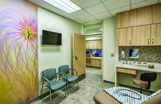
The goal of interior design scheme was to make the spaces brighter, lighter, and warmer using natural elements such as wood and stone, which would also help connect the building to the forested site, says Kristen DelGandio, vice president and interior designer at Wilmot Sanz.
One area where this was especially difficult was in the elevator lobbies, where budget constraints prevented the removal of all the granite covering the walls and floors. As a solution, designers took inspiration from the clinic names, which reference natural resources in the region, and installed large backlit photographic close-up images of wood, water, stone, and plants to conceal some of the granite.
For example, the melanoma and dermatologic cancer clinic on the fifth floor is named “Chesapeake” and features satellite images of the Virginia shoreline. These natural images are also incorporated over the registration desk in each clinic, as well as in waiting areas and examination rooms.
Residential touches abound throughout the facility. For example, the patient registration area on the first floor and the infusion center on the ninth level feature living room-style layouts with comfortable furniture and gas fireplaces with stone surrounds. Representatives of various employee disciplines voted on the furniture and interior colors, while the fireplaces specifically were requested by the Inova Patient Advisory Board, DelGandio noted. Artwork throughout the building, both donated and commissioned, is carefully selected by a consultant to help create a healing, positive environment, said Graves.
Another challenge on the project was housing all the equipment for the cancer center, including high-density radiation, proton therapy, and diagnostic imaging, which is very large and requires extensive shielding. Because the existing spaces were inadequate, Wilmot Sanz designed a 107,000-square-foot addition constructed of precast concrete in the rear of the complex. Called the Pavilion, the new building features walls up to 16 feet thick and includes four linear accelerator vaults and two proton therapy vaults.
“This is one of the few proton facilities in the country, so we wanted to design a statement building,” says Dwight Fincher, principal at Wilmot Sanz . “We felt the simplest way to do that was to create this illuminated glass box that’s a very striking but subtle way to call attention to the special activities that happen inside.”
Personalized Delivery
Since opening, the facility has received positive feedback from the patients, with more than 400 patients receiving treatment daily, Deeken says. “Cancer treatment is an intense and intimate experience,” he says. “At Inova Schar, we are intentional not only with our personalized, multidisciplinary care, but also with our patient experience.”
Jennifer J. Salopek is a freelance writer in McLean, Va. She can be reached at jjsalopek@outlook.com.
Project Details
- Project name: Inova Schar Cancer Institute
- Project completion date: May 201 9
- Owner: Inova Health System
- Total building area: 465,670 sq. ft.
- Total construction cost: Confidential
- Cost/sq. ft.: Confidential
- Architecture: Wilmot Sanz (architect of record, design architect), Stantec (associate architect for proton therapy)
- Interior design: Wilmot Sanz
- Builder: Clark Construction Group
- MEP Engineering: Leach Wallace Associates, Bard, Rao + Athanas (associate engineer for proton therapy)
- Structural Engineering: Cagley & Associates
- Civil Engineering: Dewberry
- Medical Equipment Planning: Shen Milsom & Wilke
- IT Consultant: S2N Technology Group
- Low Voltage Consultant: Enfinity Engineering
- Life Safety Code Consultant: Jensen Hughes
- Geotechnical Engineer: ECS Mid-Atlantic
- Exterior Envelope Consultant: Wiss Janney Elstner
- Elevator Consultant: Liberty Elevators
- Dietary Consultant: Clevenger Frable Lavallee
- Art consultant: Fitzgerald Fine Arts
- Art/pictures: Distinctive Art Source
- Carpet/flooring: Shaw Contract Group, Tandus
- Ceiling/wall systems: Armstrong Ceilings
- Doors/locks/hardware: Marshfield/Eggers, Schlage
- Fabric/textiles: Arc Com, Designtex, Momentum, Architex, Stinson, Maharam
- Furniture—seating/casegoods: IDA, Arcadia, Allseating Ingra
- Handrails/wall guards: Construction Specialties
- Headwalls/booms: N/A
- Signage/wayfinding: FMG Design
- Surfaces—solid/other: Corian, Avonite, Wilsonart, LG Hausys HI-MACS®, Samsung
- Wallcoverings: MDC


