Blog
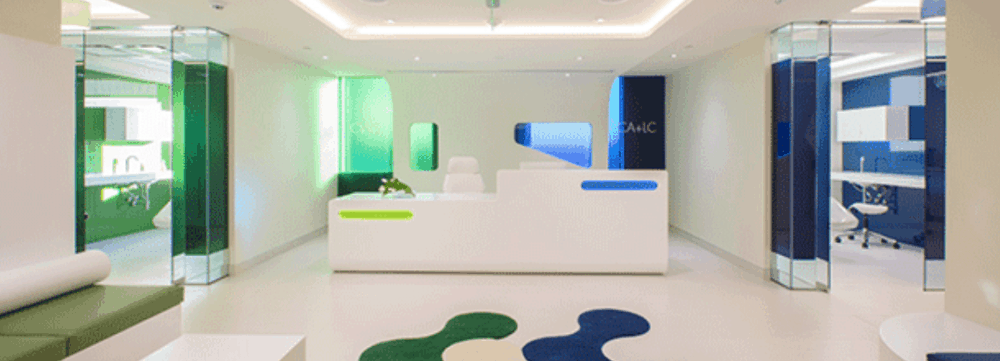
Strategic Use of Color and Layout Merge Two Clinics

Clinics are accounting for more and more of the healthcare projects being completed each year. The factors fueling the rise are many including increased demand for primary care services, access
Clinic Environments – Fun and Bold
The less-stringent codes of clinic environments often allow designers to “have some fun,” introducing bolder designs and palettes while using hospitality- and retail-inspired public spaces that deliver on consumer desires for comfort and service.
Marie Wikoff is the creator of Wikoff Design Studio based out of Reno, Nevada. Her expertise in healthcare design has helped modernize healthcare organizations locally, regionally, and internationally, improving patient experience and outcomes. Her credentials include Evidence-Based Design Accreditation and Certification (EDAC), American Academy of Healthcare Interior Designer (CHID), the National Council of Interior Design Qualification (NCIDQ) and LEED AP. Contact Marie Wikoff
Source: Jennifer Silvis. “Trends.” HCD Magazine, www.healthcaredesignmagazine.com/trends/march-online-focus-clinic-design/.


