Blog
Doctor’s Chaotic Back Office Makeover
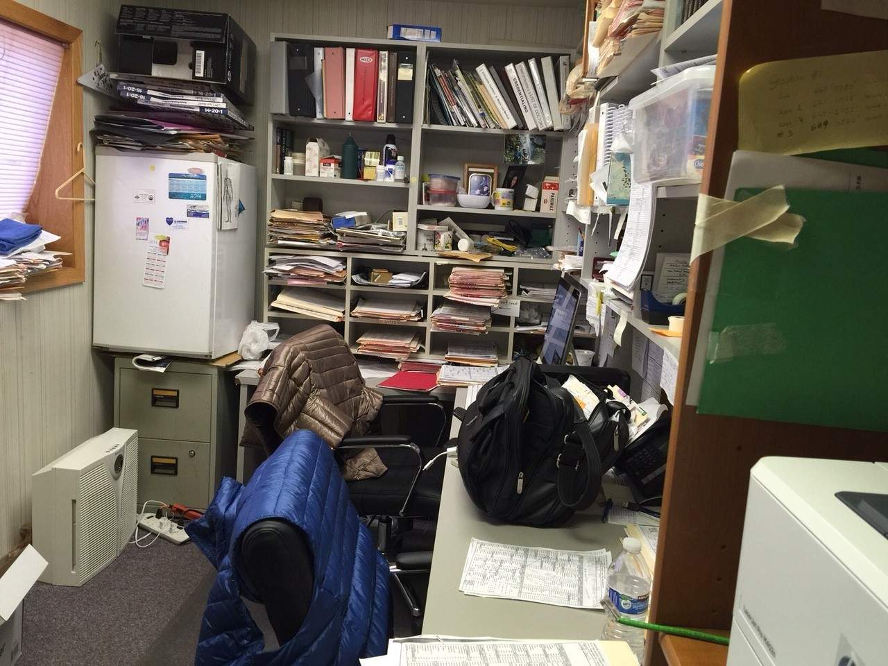
 Everyone loves a good makeover story. The image shown here is of an actual back office belonging to one of the most sought-after specialty doctors in the US. The reality is that when a doctor is that busy, his/her back office is bound to be chaotic.
While many patients complain of back pain, imagine what kind of pain the staff here complain of? No offense Doctor!
The Back Office Mess is a Common Issue
As a designer, I can attest that a messy back office is a common issue and not just for doctors but anyone who is busy. While the front office and waiting room can be the epitome of cool, calm and collected, the back office is the most neglected yet oft used room in the practice.
Healthcare professionals use the back office to chart, take lunch breaks and store mail, charts, periodicals and procedure notebooks. In this case particular case, a small window casts a glare on computer screens, so the shade is never opened to utilize natural light. Color scheme? Not even a consideration.
Healthcare designers can help no matter the budget. As design professionals, its our job to create beautiful, functional work environments that will improve staff output.
Example Makeover Ideas
For fun, I perused the web looking for example makeover ideas that could easily be implemented to help revamp the back office shown above. These examples are not Wikoff Design Studio creations. See Wikoff Design Studio’s projects.
-
Centralized Desk, Shelving and Light 2-Part Color Scheme
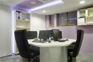
 This example was inspiration I found on the web. It is a great example of of a small, well designed space. The design is set up for multiple work stations in a small area. It features a sleek, compact, module seating plan to accommodate at least three people and their computers. Placement of the desk is strategically centered to avoid glare from the window. Shelving is on the periphery, ready for manuals and charts. Two soft contrasting colors on the walls sooth and define the space.
 -
Bright White Natural Color Scheme and Layered Shelving
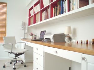
 White, white, and more white – a great solution to give small office spaces an open and capricious vibe. The long plank desk shown here uses the space well and can easily accommodate two. The finished natural wood really pops against the white and modernizes the space. The overhead layered shelving is within reach for mail, books, charts, etc. Office chair is sleek, yet offers lumbar support and is adjustable for height.
Designed Spaces Can Improve Output
Most interior designers have a limitless bank of ideas for small-space office needs. As design professionals, it’s our job to create a place that will tempt you to linger a little longer, finish up those last few charts, and end each day knowing that you were productive.


