Blog
The Impact of Color in Healthcare Design
 The following information comes from the Parkin Blog of Parkin Architects Ltd. It summarizes Parkin’s research findings surrounding the use of color in healthcare settings, proving that color is a fundamental element in design – not only for its impact on aesthetic and technical aspects of human-made environments, but also for its influence on psychological, physiological and social reactions of human beings.
Color and Evidence-Based Design
Parkin’s EDAC Group has completed thorough Evidence-Based Design research, which supports specific recommendations for mental health centers and psychiatric hospitals. We follow these guidelines when determining colour specifications for mental facility corridors, patients’ rooms, and examination rooms.
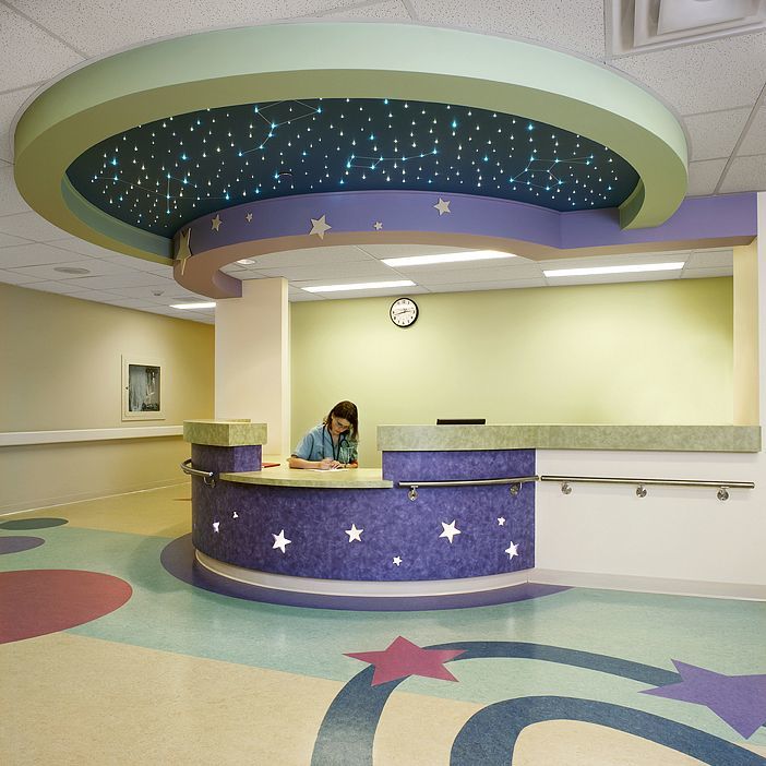
The emphasis is on eliminating the “institutional look.” Parkin designers strive to create a more “ideal home” atmosphere. There are a number of techniques that can be used to reach this goal:
- Sensory overload should be avoided and relaxation furthered by cool colours.
- Lighting should be on the warm side.
- Avoid lighting that is too uniform (meaning lighting that doesn’t produce shadows). Shadows are a natural experience in the environment.
- Design Guide 2010 for mental health facilities suggests at least one of the walls should have a soothing warm colour accent to avoid an all neutral, institutional look.
- Isolation rooms should be cozy, inviting, sparsely and safely furnished; they should not look like punitive environments.
Color and Mental Health
The following chart illustrates the various ways different colours are believed to influence mental health.
Source: Cognitive Behaviour Therapy Self Help Resources; In Colour & Wellbeing.


1 Comment
The Colors of the Reno Ronald McDonald House | Wikoff Design Studio
May 4, 2015[…] To read more on the colors in the Parkin Color Chart and to read our recent blog post on the importance of color in healthcare design, click here. […]