Blog
2017 Design Showcase Award of Merit: Going Places

Every year, Healthcare Design Magazine showcases the best hospital designs. This design recently caught my eye because of it’s whimsical approach to the architecture and it’s use of color and space on the inside. The information below was originally posted on healthcaredesignmagazine.com. It was written on July 31st, 2017 by Jennifer Kovacs Silvis, editor-in-chief. Enjoy!
The Buerger Center for Advanced Pediatric Care was completed in July 2015, the first healthcare building of Children’s Hospital of Philadelphia’s (CHOP) new South Campus in Philadelphia. The $376 million project includes 430,000 square feet of ambulatory care clinics and ties to CHOP’s main hospital across the street on the North Campus. A significant piece of the design intent was to recognize the span of patient ages represented in the population being served: “They track these children from childhood to adulthood, so it’s not just a place for kids,” says Mark Shoemaker, principal at Pelli Clarke Pelli Architects (New Haven, Conn.).
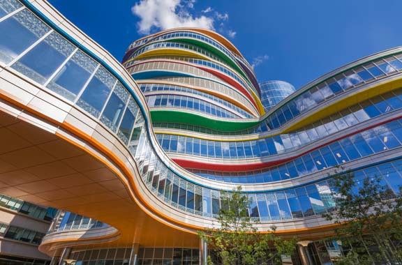
The location offered the organization the ability to create a new centerpiece, as well, building on CHOP’s signature use of color and using an undulating form to establish a non-institutional setting that further distinguishes the provider from its nearby institutional partner the University of Pennsylvania. The project was one of two Award of Merit winners in the 2017 Healthcare Design Showcase.
Here, we explore the three design elements most recognized by our jurors.

Buerger Center for Advanced Pediatric Care, Children’s Hospital of Philadelphia, Location: Philadelphia, Pennsylvania, Architect: Pelli Clarke Pelli
1. Whimsical sophistication
The Buerger Center is located on a prominent corner on campus, something the design team hoped to take advantage of in the exterior treatment. “We wanted very much to establish a clear image as you approach the building, so that was the genesis of doing something a little more sculptural, and the color was an element we wanted to incorporate as a CHOP standard,” Shoemaker says. The resulting exterior essentially slips and slides the floors, using the soffits created as a place to locate the building’s bold primary colors.
On the interiors, the colors are mirrored, as is the curvature and softness of the exterior lines, specifically in a winding ramp system that takes visitors from the first to second floor to access the bridge that spans to CHOP’s main hospital—inserting a playful replacement to a traditional stair or escalator that offers opportunities for respite or play.
2. Journey mapping and simulation modeling
The design team of Pelli Clarke Pelli Architects and FKP was relentless in its desire to not just understand the patient and visitor experience, but to improve upon it. “We spent a lot of time tracking the various paths, staff and patients and patient families, and how they would move through the building … both in terms of entering the building and exiting the building, and talking about first-time visitors and those who are using the facility on a regular basis,” Shoemaker says.
Making the user experience as simple as possible became a core tenet of the project, with navigation designed to be intuitive. “If we didn’t put any signage up, how would you give people cues and give them a sense of where they are?” Shoemaker describes. One of the most significant results of this effort is that all public spaces face a public garden outside, offering users a constant touch point.
3. Wait. Learn. Play.
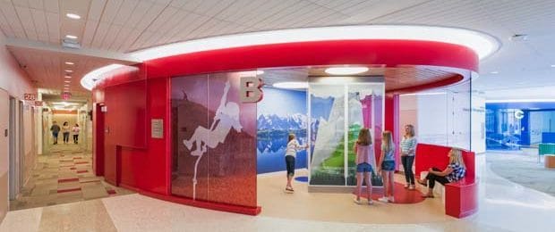
Another solution tied to the patient journey are “Wait. Learn. Play.” areas introduced on the clinic floors. With waiting programmed into long, linear spaces along the window wall, the team wanted to avoid using a traditional adjacent row of doors leading back to clinical areas. Instead, the clinics don’t have doors and these flexibly programmed spaces are sited just outside, distinguished by dynamic colors and serving as focal points. “We wanted to liven up the space a bit, make it more interesting,” Shoemaker says. These oval-shaped “portals” are semi-enclosed and on the public-facing side feature flexible zones that can be used for quiet respite, patient education, or fun, determined by the medical discipline being served. On the clinic-facing side, a checkout desk is sited within the portal, marking a clear destination that eases the journey on the way out, too.
Source:
Jennifer Kovacs Silvis is editor-in-chief of Healthcare Design. She can be reached at jennifer.silvis@emeraldexpo.com.


